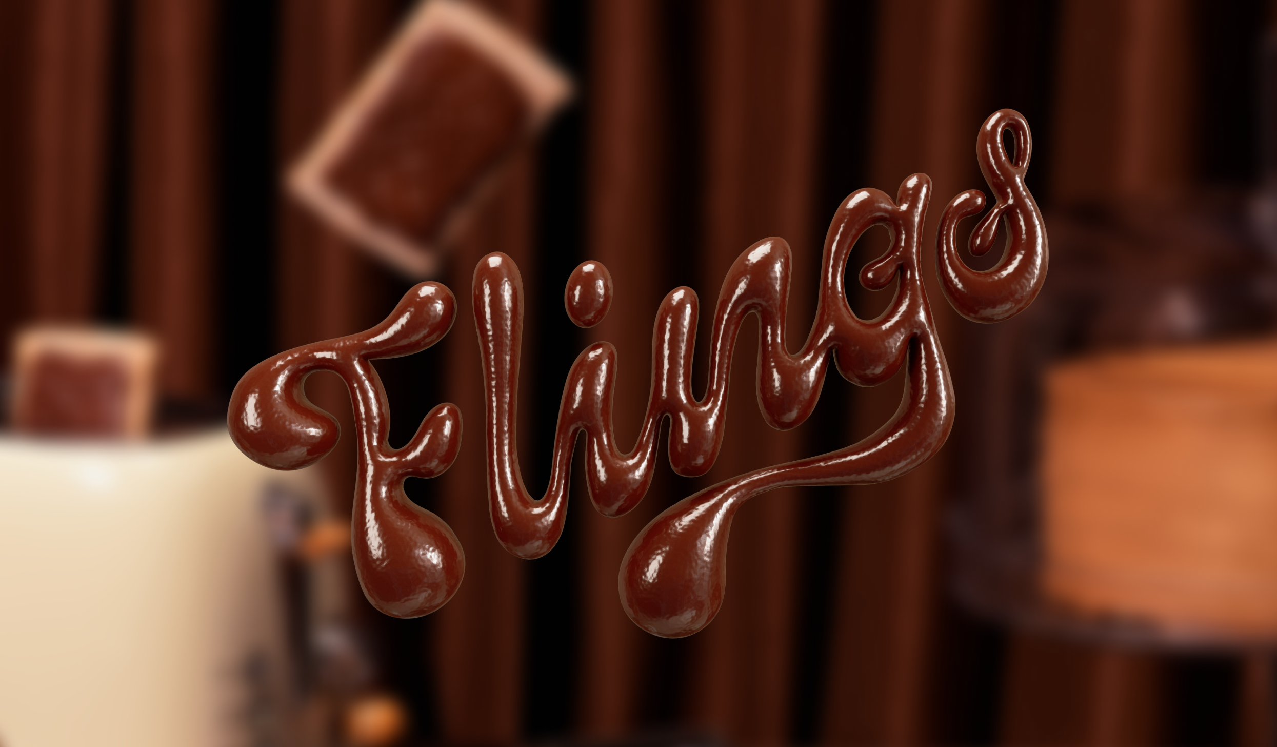
FLINGS
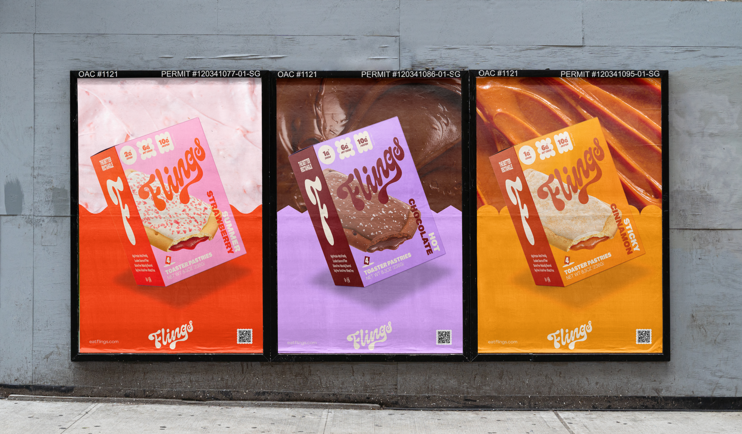
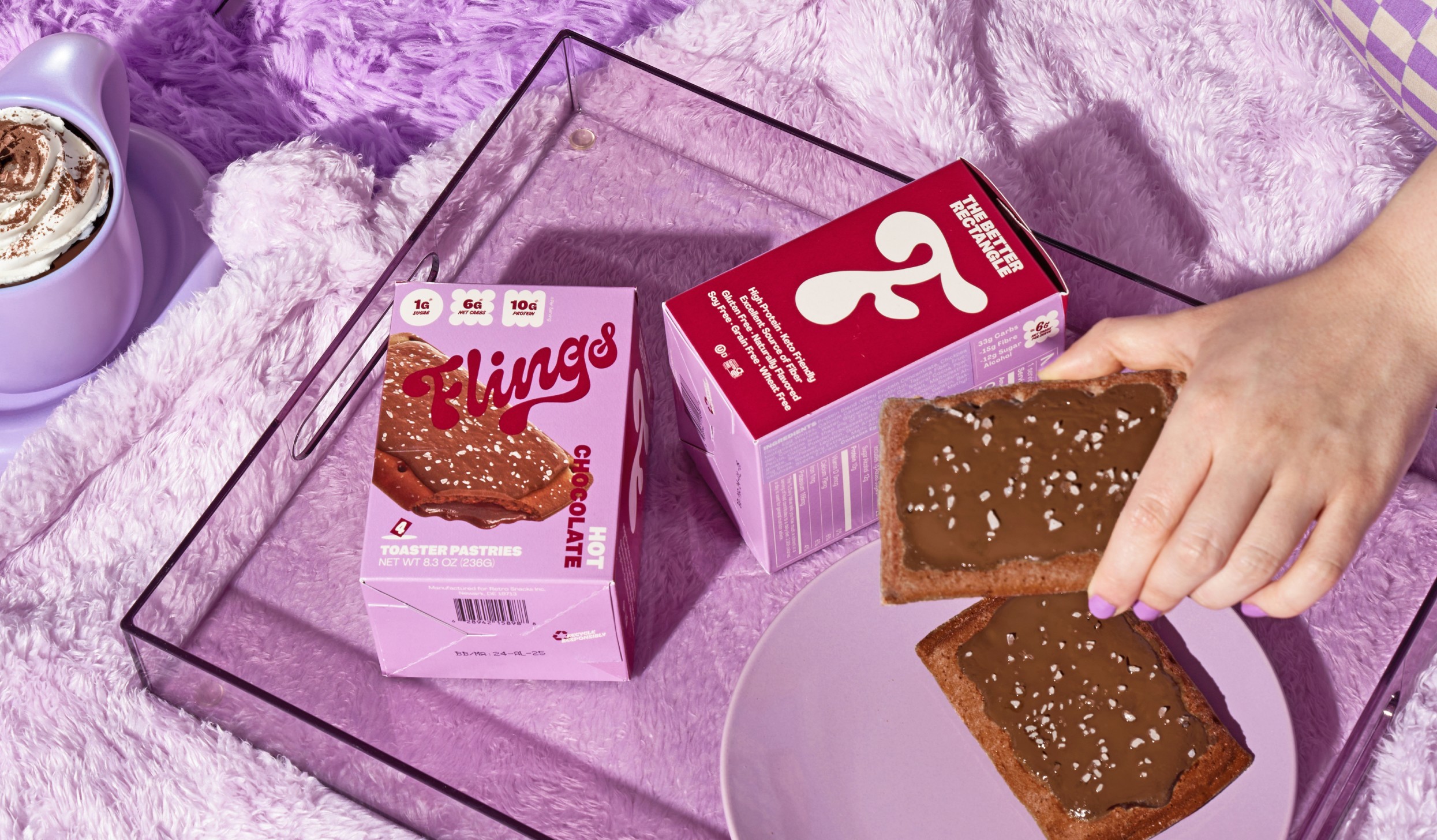
The brief was to create nostalgia. To ignite childlike joy with a snack that reminds us of the past, but with a more mature, modern aesthetic. Flings is the brain child of two food-entrepreneurs who took the old-school (and sometimes questionable) snack and transformed it into a healthier, more natural adult treat.
The brief was to create nostalgia. To ignite childlike joy with a snack that reminds us of the past, but with a more mature, modern aesthetic. Flings is the brain child of two food-entrepreneurs who took the old-school (and sometimes questionable) snack and transformed it into a healthier, more natural adult treat.
The Blurr
There are not a lot of food items that define the baby-boomer generation like the classic toaster pasty. They were convenient, relatively cheap and every child knew of them, loved them and grew up eating them – not only in the US but also across the world.
The brief was multi-layered. On the one level, our brand identity and all its supporting assets need to capture the feeling of childhood, the thrill of after-school treats. On another level – and based on our extensive research – we discovered that adults are constantly looking for the life-hack of sugary snacks. Consumers are serial snackers, and are on a constant search for that snack that satisfies the tastebuds and represses the guilt.
From a design lens, our team knew we had to encapsulate key emotions: nostalgia, childlike positivity, fun. The challenge was to ensure the brand language balanced lightness and cheekiness with designs that also appealed to health-conscious consumers – astute, mindful consumers who, unlike their much younger selves, have learnt to carefully read the fine print on food packaging.
SERVICES
Market Research
Brand Strategy
Naming
Tone of Voice
Visual Identity
Packaging
Art Direction
Renders
Motion Design
UX/UI Website Design
Brand Guidelines
Social Media
There are not a lot of food items that define the baby-boomer generation like the classic toaster pasty. They were convenient, relatively cheap and every child knew of them, loved them and grew up eating them – not only in the US but also across the world.
The brief was multi-layered. On the one level, our brand identity and all its supporting assets need to capture the feeling of childhood, the thrill of after-school treats. On another level – and based on our extensive research – we discovered that adults are constantly looking for the life-hack of sugary snacks. Consumers are serial snackers, and are on a constant search for that snack that satisfies the tastebuds and represses the guilt.
From a design lens, our team knew we had to encapsulate key emotions: nostalgia, childlike positivity, fun. The challenge was to ensure the brand language balanced lightness and cheekiness with designs that also appealed to health-conscious consumers – astute, mindful consumers who, unlike their much younger selves, have learnt to carefully read the fine print on food packaging.
Through our research, which spanned over two years and across both the US and Canada, we discovered that as these children got older – and as the world became more health-conscious – this acquired taste grew with them, and the market was expanding to include older consumers who were looking for not only convenience and familiarity, but also some health benefits.
What we discovered was that adults were craving a time when brands were more authentic, more analog. Visually, the brand language we created looks like Flings travelled back in the 80s and back to the present dressed in velvet and maybe a pair of bright happy pants. Utilising a Retro Futuristic direction across all touchpoints – we married nostalgic textures and patterns with more modern, clever language.
It took Blurr and Flings over two years to put the product on the shelves, and within the first month of its launch Flings exceeded their sales target by 100%.
On shelf and online, Flings was both familiar and excitingly new. What we achieved was a careful balancing act, with designs that carried both sentimentality and novelty.
Visit the website eatflings.com
100% more sales than anticipated at launch
10k visits to website in the first 2 weeks
20k unique visitors to website on any given day
Featured on The Dieline & Snaxshot
Launched on Amazon in August 2023
Available in 1,000+ brick & mortar stores across USA in January 2024


The Clarity
Through our research, which spanned over two years and across both the US and Canada, we discovered that as these children got older – and as the world became more health-conscious – this acquired taste grew with them, and the market was expanding to include older consumers who were looking for not only convenience and familiarity, but also some health benefits.
What we discovered was that adults were craving a time when brands were more authentic, more analog. Visually, the brand language we created looks like Flings travelled back in the 80s and back to the present dressed in velvet and maybe a pair of bright happy pants. Utilising a Retro Futuristic direction across all touchpoints – we married nostalgic textures and patterns with more modern, clever language.
It took Blurr and Flings over two years to put the product on the shelves, and within the first month of its launch Flings exceeded their sales target by 100%.
On shelf and online, Flings was both familiar and excitingly new. What we achieved was a careful balancing act, with designs that carried both sentimentality and novelty.
Visit the website eatflings.com


The Results
100%
more sales than anticipated at launch
10k
visits to website in first 2 weeks of launching
20k
unique visitors to website on any given day
Featured on
The Dieline & Snaxshot
Launched on
Amazon in August 2023
Available in
1,000+ brick & mortar stores across USA in January 2024